Alluvial diagrams and scatterplots
Overview
Teaching: 10 min
Exercises: 20 minQuestions
How do we create simple geomaps depicting new items in our collection?
What ‘different’ ways of visualizing it exist, and how useful are they?
Objectives
First objective.
Alluvial diagrams and area charts in RAWGraphs
Now, we switch to the Popular searches dataset. As mentioned before, this set includes up to 500 of the most popular queries done via uio.oria.no. We will try out some more fancy visualizations, as well as a more ‘serious’ scatterplot graph in this module.
First steps:
-
Create a new Google Spreadsheets file (
File>New Spreadsheet) -
Choose
File>Import>Upload. ChooseInsert new sheetin the next screen. -
Name the Spreadsheet and rename the imported worksheet to
UserQueries
Let’s look at the most popular queries in 2016.
Exercise 1: Exploring the top queries in 2016
First, select all cells (ctrl+A) and choose
Data>pivot table. Rename the new sheet toQueriesPivot.Let’s count the number of queries. For Rows, choose
Search String, and for Values, chooseSearch string(COUNTA).Make sure the Rows are sorted by
COUNTA of Search Stringand change the order toDescending.The numbers are kind of low, aren’t they? Only 13 searches for historisk tidsskrift.
Discussion
What is the problem?
Remove
Search Stringfrom valuesAdd field to values:
SearchesChange
Summarize byto SUM and correct theSort byproperty under Rows to reflect that.Lets add some more details. Add two fields to values:
Signed inandOn CampusTry on your own to further explore the data. Anything you notice? How would you visualize this?
Let’s visualize this. We will use RAWgraphs again for this purpose.
- Go to the UserQueries sheet.
We will use the date in column R, but it is not formatted correctly for visualization in RAW. Let’s amend that.
Select column R, with the dates, and choose
Format>Number>9-26-08Go back to the pivot table (
QueriesPivot) and delete the previousSigned inandON campus.Add the field
Month (date)under columns. Removeshow totals.Select the first 10 queries in the pivot table, including the column headers and all months. Copy them (ctrl + C).
Open a new tab and go to http://app.rawgraphs.io/
Paste the data into the
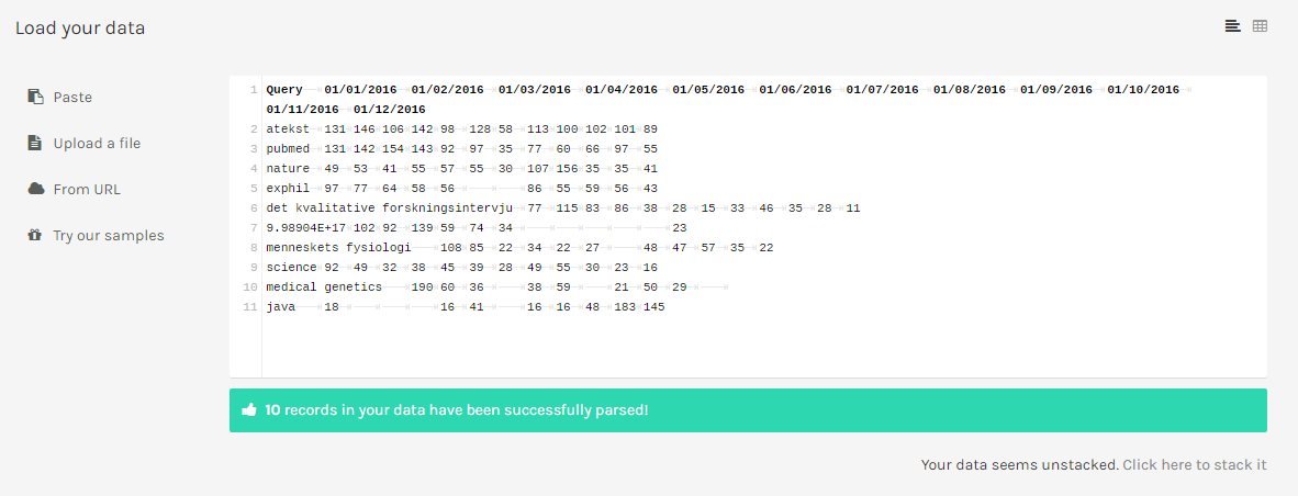
Load your datafield.Whoops! An error. What’s wrong?
Correct this by adding a name for the first column in the text field (you can observe it is now empty). Put the cursor on the first line of the text field and add the column name Query.
Notice the message under the text box, which says
Your data seems unstacked. Click here to stack it. This is caused by how we put the dates into different columns.From minitab.com:
“If data are unstacked, each column contains observations from one group. There is no grouping column.”
“If data are stacked, the sample values for all groups are in a single column, with a corresponding column of labels that identifies the sample. This column of labels is referred to as a grouping column...”
Hence, we have to stack the data to use it in RAWGraphs. Luckily this can be done for us:
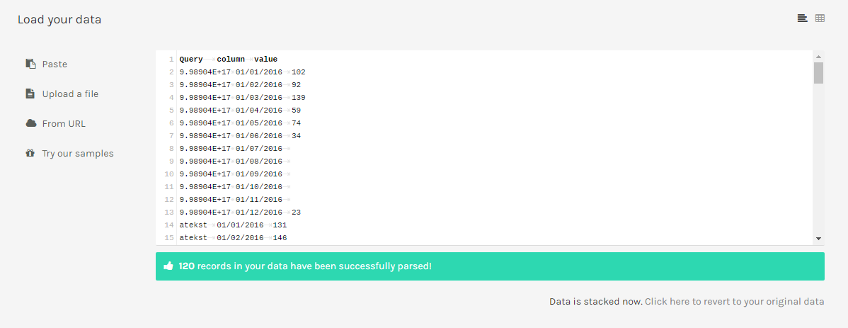
- Click on the message to stack the data. Under
Select a dimension to stack onchooseQuery. Notice the difference? The contents of the previous columns are transferred into different rows.
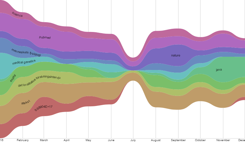
Scroll down, choose the
Streamgraphchart.Drag the
Querydimension into theGroupfield, the [todo: check] column into the Date field, and the Value into theSizefield.
Any observations from the data?
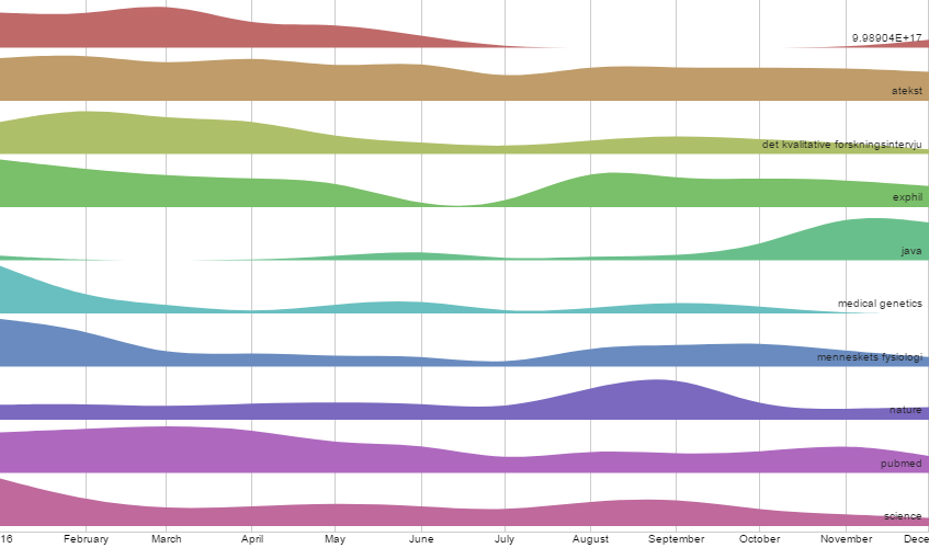
Try out some other graphs. In particular, the Area graph, the Bump chart, and the Horizon graph. Which do you like most and why?
Finally, we are going to make a scatterplot.
What is a scatterplot?:
It is a type of chart which can be useful for showing relationships between two to three variables, to show data distributions, and for displaying trends. Using a scatterplot it is possible to discover patterns, correlations, clusters and outliers, and it is possible to compare a large number of values.
Exercise 2: Scatterplot
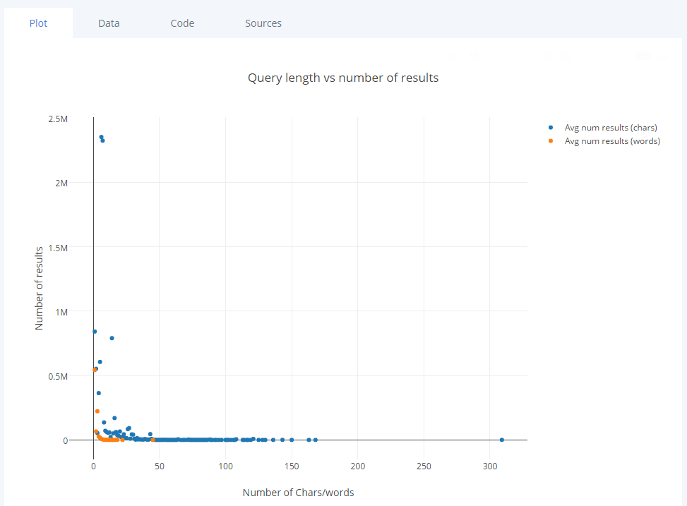
For our scatterplot, we are going to look at the relation between the length of a query, and the number of results retrieved in the search system. To do so, we have to extend the dataset.
First, we will add a length in characters column to our source data.
Go to the first empty column in the
UserQueriessheetType
=LEN(B2)in cellV2Copy this formula (ctrl+C), select the whole V column and paste it (ctrl+V).
Make sure the length value is now visible in the whole column.
- Add the name
Query Length (characters)to the column (i.e. in the first row).Next, we will add a column reflecting the number of words of a query.
Go to the first empty column in the UserQueries sheet (most likely
W)Type
=LEN(B2)-LEN(SUBSTITUTE(B2;" ";""))+1Copy this formula (ctrl+C), select the whole column and paste it to fill it (ctrl+V).
Add the name
Query Length (words)to the column.Verify if the formula is correct by comparing the calculated number of words to the
Search Stringcolumn.Now, we need a pivot table again.
First, select all cells (ctrl+A) and choose
Data>Pivot table. Rename the new sheet toScatterPivot1.For the rows, add
Query length (characters)and removeshow totals.For the values, add
Results.
Summarize by SUMdoesn’t appear to be correct. What would you choose and why?
Change the
Summarize bytoAVERAGE.Duplicate the pivot table (right click the tab and choose
duplicate). Rename the copied table toScatterPivot2.Remove group by
Query length (characters)from RowsAdd
Query length (words)to RowsRemove
Show totalsNow go to plot.ly/create.
Copy all the values from the
ScatterPivot1table.Paste them into
Grid 1of plot.lyCopy all the values from the
ScatterPivot2table.Make a new Grid using
+Grid. Paste the data intoGrid 2of plot.lyClick
+Trace. ForX, chooseGrid 1 - Ain the dropdown menu. ForYchooseGrid 1 - B.Again, click
+Trace. ForX, chooseGrid 2 - A. ForYchooseGrid 2 - B. Scroll down to do so.Rename the headers
Restyle the graph (Go to
Style)Go to
notes(Add anAnnotationto explain the outliers).
Hence, we obtained an image of the number of characters/words versus the number of results. We can observe a slight correlation (i.e. more characters results in less retrieved results).
Further exercises
If you have time, you can explore the queries more qualitatively: what do the long and short queries actually look like? This can easily be done using the pivot tables
[todo: lesson ending, further reading.]
Read more
Key Points
Using RAWgraphs you can try out graphs that give more possibilities than the Excel spreadsheets, for example, alluvial diagrams
Scatterplots are graphs useful for showing correlations, distributions, and trends