Introduction
Overview
Teaching: 30 min
Exercises: 0 minQuestions
What is visualization?
What are common fallacies in terms of visualization?
Objectives
First objective.
Visualization: An introduction
“A picture can say more than a 1000 words”, is the old adagium. This also holds true for data: some large datasets which we work with, only reveal some of their secrets after carefully visualizing them.
The question is, of course, how to actually visualize data in practical terms. Also, the exact form of visualizations influence how useful they are.
Some famous examples:
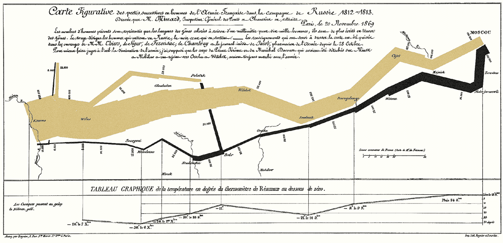
Depicting events Russian military campaign by Napoleon (1812-13). Can make information more clear. (https://www.edwardtufte.com/tufte/minard)
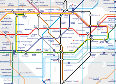
Ease navigation: Tube map London (https://en.wikipedia.org/wiki/File:TubeMapZ1_TFL.png)

Saving lives: tracing the source of a cholera outbreak in Soho, London (1854), map used to find cause of epidemic. Dr. John Snow (source: https://www1.udel.edu/johnmack/frec682/cholera/, https://www1.udel.edu/johnmack/frec682/cholera/snow_map.png).
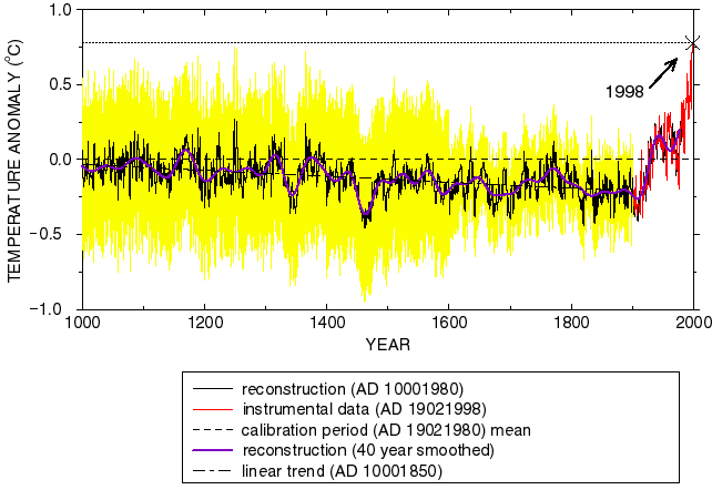
Provide insights into scientific data: climate change “hockey stick” graph (Michael E. Mann, CC-BY) https://upload.wikimedia.org/wikipedia/commons/0/0a/Mann_hockeystick.jpg
Visualizations
Let’s start by looking at the concept of ‘visualization’.
Defining Visualization
Cairo (2016)’s definition: “A visualization is any kind of visual representation of information designed to enable communication, analysis, discovery, exploration, etc.”
Davis (2009) distinguishes the following types of visualization:
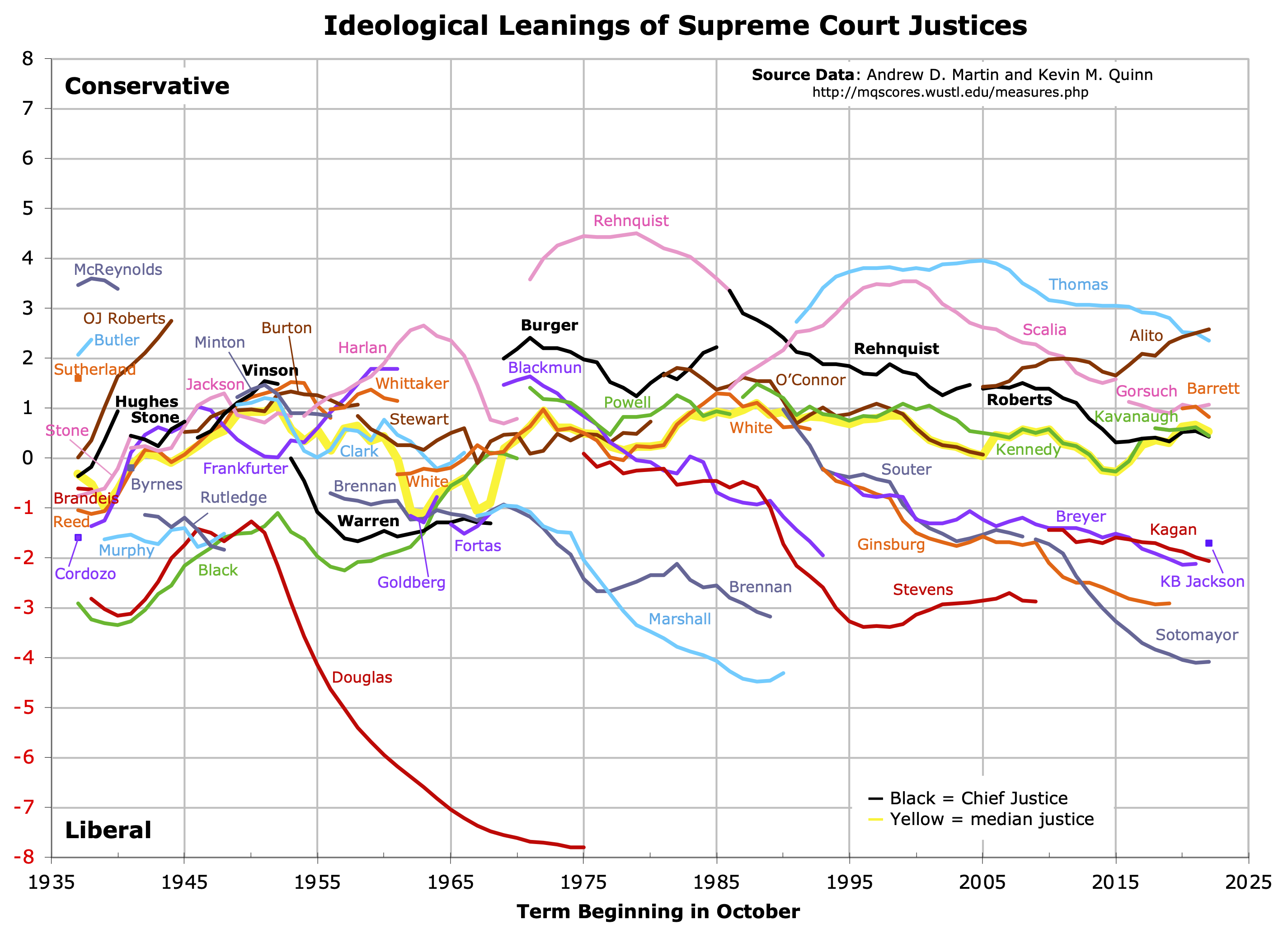
- Statistical visualizations e.g. Supreme Court Justices
- Infographics e.g. An internet minute
- Maps e.g. New York Times immigration explorer
- Network visualizations e.g. Social network analysis visualization
- Artistic visualizations (“data as art”) e.g. “Forest of Numbers”
Hence, the word ‘visualization’ encompasses a wide range of possible diagrams. In this workshop, we will not look at all these different types of visualizations, but mainly focus on (statistical) charts.
What is a chart, then?
Cairo (2016) defines it as such: “A chart is a display in which data are encoded with symbols that have different shapes, colors, or proportions.”
Common goals of visualization
Visualizations can be made for a wide range of purposes. It may reveal things that were not visible before, and can be used for exploratory data analysis. Potential goals are manyfold:
- Analyzing data, often exploratory “Graphing data needs to be iterative because we often do not know what to expect of the data; a graph can help discover unknown aspects of the data, and once the unknown is known, we frequently find ourselves formulating new questions about the data.” (Cleveland 1985, as cited in Spence, 2001)
- Disseminating results of analysis, for instance in a news article or scholarly paper
- Decision making, taking actions based on evidence in the data
- Conveying a message, for instance social issues
While there are many other potential goals for visualization, we mainly focus on exploratory data analysis and dissemination in this lesson.
Qualities of visualizations
Cairo (2016) suggests a number of qualities of visualizations (which are often not met in practice!):
- Functional It should depict data accurately, but also be useful to people
- Beautiful A visualization should be ‘attractive’ to different audiences
- Insightful It should reveal evidence that we could have missed without the visualization
- Enlightening A visualization may “change our minds” (hopefully for the better…)
- Truthful A visualization should depict truthful and honest research
The last point is especially important: statistics may not be (entirely) correct, and this applies more gravely to visualizations.
Fallacies of visualization
Designing an understandable and reliable visualization is far from straightforward. One the one hand, there is the importance of the origins, quality and scope of underlying data. It is essential to understand the whole picture, that is, how data is generated, if it is complete, or if it is a sample.
For instance, in this lesson we will be working with a dataset containing popular searches. It is important to ask oneself what “popular” means in this case.
The popular searches dataset
This dataset, originating from Primo Analytics, contains up to 500 different query variations per month, as performed in a Norwegian university’s library discovery system. In the case of this university, this amounts to 5% of all searches done in the system.
Moreover, data processing is important, as each round of processing may influence what you see in the end (and this is even before starting to visualize data).
Cairo (2016) has summarized some of our inherent biases which have an effect on our judgement of visualizations:
- Patternicity “Detecting interesting patterns, regardless of whether or not they are real”
- Storytelling Trying to find cause-effect relationships for patterns we observe
- Confirmation Confirming our own beliefs (cognitive dissonance, confirmation bias)
Also during the creation of visualizations, we may introduce issues (consciously or unconsciously) due to bias or mistakes in interpretation. See Flowing Data for a summary of common ‘visualization lies’.
While there is always some interpretation involved in both creating and reading visualizations, we can try to keep in mind some of these issues and try to prevent them.
Read more
- Tufte (1983). The Visual Display of Quantitative Information
- Cairo (2016). The Truthful Art - Data, Charts, and Maps for Communication.
- Visualization examples: informationisbeautiful.net/
- Article on visualization in a library context (Davis, 2009): inthelibrarywiththeleadpipe.org/2009/not-just-another-pretty-picture/
Key Points
Visualization comes in many forms and variations.
It is not straightforward to create reliable and engaging visualizations, and one has to keep in mind our cognitive biases.
When viewing visualizations made by others, always keep an eye open for ‘visualization lies’