Pivot tables and basic visualizations
Overview
Teaching: 10 min
Exercises: 40 minQuestions
What are pivot tables?
How do we use them to summarize data?
How do we create basic visualizations from the summaries in pivot tables?
What are design guidelines for basic visualizations such as column charts, bar charts and pie charts?
Objectives
First objective.
The why and how of pivot tables
We will work with very large sets of data, regarding new physical items and popular searches, including 10,000s of rows. To be able to actually visualize these data, we have to apply some kind of summarization. This can be done in different ways. One way to summarize data is by writing a script that does the summarization for you, which we will not really touch upon in this workshop, but for which we will give further pointers at the end of this workshop. A second way is by using a common package to do these summaries in a so-called pivot table.
Introduction to pivot tables
From Wikipedia: “In data processing, a pivot table is a data summarization tool found in data visualization programs such as spreadsheets or business intelligence software. Among other functions, a pivot table can automatically sort, count, total or average the data stored in one table or spreadsheet, displaying the results in a second table showing the summarized data.”
Tools which can be used to create pivot tables are for instance Microsoft Excel, OpenOffice/LibreOffice Calc, Google Spreadsheets. In this workshop, we will work with Google Spreadsheets, but most of the functionality works in the same way in both Excel and OpenOffice. Compared to Google Spreadsheets, Microsoft Excel has some additional features, which allow for more advanced filtering and processing.
First, we have to import our data into Google Spreadsheets:
-
Open Google spreadsheets, choose
Blank -
Make sure that the correct “locale” (region settings) are set. Choose
File>Spreadsheet settings. Underlocale, choose:Norway (Norwegian Bokmal). This ensures that comma is understood as the decimal point, that dates are handled correctly, etc. -
Choose
File>Import>Upload. ChooseSelect a file from your computer. Locate the file NewPhysicalItems.xlsx and select it. -
When requested in the dialog box select
Insert new sheetin the next menu. -
Name the worksheet NewItems (to rename the sheet double click on the sheet name (at the bottom of the window) or click on the small arrow next to the name and choose
Rename…).
Some notes about the use of Google Spreadsheets to keep in mind
- It can be slow from time to time, when using a large dataset such as the New Physical Items dataset. A message “script on this page may be busy, or it may have stopped responding” can sometimes appear. Be sure not to close the page, but to select ‘continue’, or ‘wait’, until the processing finishes. The Chrome browser seems to work slightly faster than Firefox in this regard.
- Copying text using the menu elements does not work on most machines, so use the keyboard shortcuts Ctrl+C and Ctrl+V on Windows, or Cmd+C and Cmd+V on Mac to copy and paste, respectively. Using keyboard shortcuts is good practice anyways, that can make you work more efficiently in any software.
Exercise 1: Create a Pivot Table showing the most frequent books per publisher
Let’s create our first pivot table. Follow the following steps:
Select all the data in the NewItems sheet (Ctrl + A (Windows) or Cmd + A (Mac))
Choose
Data>Pivot table…Notice at the bottom of the window that a new sheet has been created. Rename it to PublisherPivot (again, by double clicking on the sheet name or right-clicking and choosing
Rename…)Now, we are ready to add rows and values to our pivot table. For this, use the ‘Report Editor’ functionality on the right-hand side.
- Rows: Click
add field. ChoosePublisherfrom the list of fields which appearsIt should now show:
Group by: Publisher
- Values: Click
add field. Again, choosePublisherfrom the listIt now shows:
Group by: publisher, andSummarize by: SUM.
- Click on
SUMand change the value toCOUNTA(counting all values)We now see a list of publishers and how often they appear in our dataset, in our pivot table. You may observe that some more data cleaning could be done (e.g. merging ‘Ace Books’ and ‘Ace Books’ inc.).
Right now, the order is alphabetical, which does not reveal many insights in the most common publishers in our datasets. Thus, we have to adapt the sorting. We now will order the publishers by how often they occur in the dataset.
- Under rows, click on
Sort by: Publisher. Choose the optionCOUNTA of Publisherfrom the list.Now, we see the ordering has changed, but it starts at the lowest value, not the highest one. Since we’re interested in the most frequently occuring publishers, we will have to reorder the set:
- Click
Order: Ascending, and change the value to:Descending.This results in a list of the top publishers in this dataset.
Answer
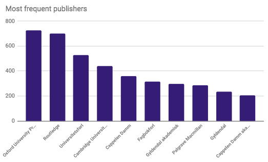
Oxford University Press		726
Routledge			700
Universitetsforl			529
Cambridge University Press	440
Cappelen Damm			360
Fagbokforl			314
Gyldendal akademisk		297
Palgrave Macmillan		287
Gyldendal			235
Cappelen Damm akademisk		207
Discussion
Can you spot some issues with the pivot table we just made?
For these types of lists, data cleaning (which can for instance be done via OpenRefine) is very important, since variations in names will directly influence the counts we obtain. Often this ends up as an iterative process where you start by doing some initial cleanup of the data, then carry out a first analysis (like we just did), which reveals more issues with the data that you can go back to clean up before continuing.
Charting in Google Sheets
After creating our first pivot table, we can now move on to creating our first chart in Google Spreadsheets.
Exercise 2: Creating our first chart in Google Spreadsheets
First, select the top 10 of publisher names and number of items with the mouse.
Choose
Insert>Chartfrom the top menuAs you observe, Google Spreadsheets provides a chart editor where you can select the chart type (in the “Chart editor” on the right side). Check out the different options by selecting a number of them.
Discussion
Which of the visualizations would you choose for this dataset? Why?
- Select the
Column chartfrom theChart typedropdown menu.To change the appearance of the graph, just click on the elements of it. Try out some options:
Left-click on the series (the bars in the graph) and change the color to your liking.
Left-click on the names of the publishers, and change the font from
12to10.Let’s remove the legend, since it is not very useful in this graph. Click on the legend of the graph, and under
Legendon the right-hand side, choosePositionand click onnone..Add a title to the graph (right-click the graph, and select
Chart & axis titlesand add the title in the right box. You could also add it using the right-hand sideChart editorbox, selecting the second tab:Customize>Chart & axis titles).Try out the other options to customize your graph yourself.
- E.g., change the orientation of the labels, or the scale of the Y axis.
Answer
Exercise 3: Summarizing author data
Let’s duplicate our pivot table and change its contents.
Right-click on the name of the Pivot table (i.e.,
PublisherPivot) and selectDuplicateChange the name of the sheet to AuthorPivot
Delete the graph by clicking on it and pressing the backspace or delete key (or by clicking on the icon with three ‘dots’, and choosing
Delete chart). Then remove the rows and values by clicking on theX’s in theReport Editoron the right-hand side.Let’s make a new pivot table:
For the rows, now click
Add fieldand chooseAuthor.For the values, now choose
Add fieldand select againAuthor. ForSummarize by, chooseCOUNTA.For the Rows, now choose
Order: Descending, andSort by: COUNTA of Author.After a little while, the pivot table should appear, and look like below.
Answer
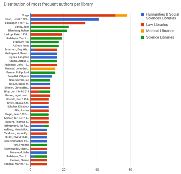
1. Norge				58
2. Ibsen, Henrik 1828-1906	41
3. Falkanger, Thor 1934-		33
4. Vance, Jack			23
5. Silverberg, Robert		22
6. Lødrup, Peter 1932-2010	19
7. Lindstrøm, Tom L. 1954-	19
8. Bradbury, Ray			17
9. Asimov, Isaac			17
10. Schartum, Dag Wiese 1956-	16
Discussion
What do you notice when looking at the pivot table?
Let’s go more into detail for this graph and filter it.
Click
Add fieldnext to the Filter label. ChooseAcquisition method.Click on
Show: All items. ClickClearand thenGIFTso that onlyGIFTis checked.Sort by
CountA of authorDiscussion
What do you observe?
Visualizing distributions per library
We have thus far looked at some publisher data, and at the authors of newly acquired books. To get more insights, we will now check how the books are distributed per library.
Exercise 4: Checking the distribution of new books per library and visualizing it
Remove the filter we have just added, by clicking the
Xnext toFilter: Acquisition methodChoose Columns:
Add field. SelectLibrary name.Now, we may have to wait a little bit, since we are generating a lot of summary data. Finally, you will see a large table with the authors as rows, and all different university libraries as columns.
We get some idea about the distribution per library, but it is quite an overwhelming amount of data. Any observations? We can notice that there is e.g. some overlap between the most purchased authors in different libraries.
Now, we can visualize this dataset using a ‘Stacked bar chart’
Select the top 40 of all author rows with all columns (to select; either click and drag, or you can click on the top left cell and, while you hold down the shift key, press the bottom right cell in our range. The latter way is especially useful if you need to make a much larger selection.)
Now choose
Insert>Chart. Go to theChart typestab. Check out the different types of graphs Google Spreadsheets offers. Finally, choose the second ‘Bar’ chart (Stacked Bar chart). Click onInsert.Go to
Customizeand add a descriptive title. Then click the names on the Y axis and change the font size to 10. Enlarge the chart vertically by dragging the blue box handle on the bottom until all author names are shown.Answer
Discussion
Any observations based on the graph?
To sum up, In our first exercises we have started to use Pivot Tables, and we have explored column charts and bar charts.
Basic charting guidelines
There are some guidelines for these types of charts, suggested by EazyBI.com (which we may have not fully followed!):
Column charts should not have more than 7 categories. If there is time involved in the data (e.g. months or years), it should always be on the horizontal axis, moving from left to right. Also, it is important to make the Y axis start at 0 to avoid misleading information.
Actually, we showed the 10 most occurring publishers in a column chart, which turns out was not the optimal choice.
Bar charts, on the other hand, can be used when having more than 7 categories. We used this type of chart in our second example. An advantage of a bar chart is that it allows for using longer category names, such as the author names we visualized. A frequently applied simple chart which we did not use is the Pie chart, which should be used with caution - ideally with only 2 categories, and with a maximum of 6. They should not be used when the category values are very similar or different.
A final guideline for these kind of graphs is to keep it simple and to reduce clutter. For instance, one should not use 3D effects in Pie charts, since they do not add any value and will make it harder to identify and compare the sizes of the pie slices (which is already hard with 2D pie charts because humans are not great at estimating and comparing angles). In general, one should remove all unnecessary decorations and lines.
Read more
- Pivot tables: en.wikipedia.org/wiki/Pivot_table
- Chart usage guidelines: eazybi.com/blog/data_visualization_and_chart_types/
Key Points
Pivot tables are data summarization tools, useful to quickly summarize data
Pivot tables can be useful for doing exploratory data analysis, but also for visualization
Data understanding and cleaning is still of key importance
Column chart visualizations should be used when having 7 categories or less
Bar charts should be used when having more than 7 categories
Pie charts should only be used with caution