Data types and temporal visualization
Overview
Teaching: 10 min
Exercises: 30 minQuestions
What types of variables exist, and how could we potentially visualize them?
How do we convert between data types?
How do we visualize temporal phenomena?
Objectives
First objective.
Data types
In the previous module, we have been working with two main columns: publishers and authors. These are called categorical variables, as their constituent elements do not have an inherent order.
To visualize those categorical variables, we had to obtain the counts of how often these publishers and authors occurred in the dataset. We did this by creating pivot tables. The counts we obtained are called numerical variables, which do have a clear order.
In this module, we are also going to look at ordinal variables. These types of variables have an implicit ordering. For instance, the days of the week are usually put in the same sequence (Monday, Tuesday, ..), and survey scales ranging from ‘very little’ to ‘very much’ can be put in order as well. To visualize these, however, we usually have to assign a numerical value to them. For instance, Monday is represented by 1, Tuesday by 2, and so forth, and the survey scale as 1 (very little) to 5 (very much).
A quick summary of data types: (Spence, 2001)
- Numerical data
For instance real estate prices, count of the number of new books by different authors
- Ordinal data (having an inherent order)
For example, the days of the week: Monday, Tuesday, Wednesday, .., or scales: very much … very little.
- Categorical data (no inherent ordering)
For instance, Horse, Giraffe, Zebra, or Emerald, CappellenDamm, DeGruyter
In the next exercise, we will experiment with converting variables.
Exercise 1: Investigate when most books were received by the library
To check when most books were received (and processed) by the university library, we have to extend the data table which we imported in the beginning of the visualization session. To this end, we will create some formulas in Google Spreadsheets (which are similar to those in e.g. Microsoft Excel). We do this in the NewItems spreadsheet with all columns and data (not in the pivot table).
We will add columns for the hour of the day, the week day and the week number.
Let’s create these three columns.
First, we are going to prepare the receiving week column. Go to the last column (
N), and type the following formula in the second row:=WEEKNUM(L2). The cell should now show a2.Select the cell containing the formula and copy it (ctrl+c). Now select the whole column by clicking on the
Ncolumn header, and paste the formula (ctrl+V). Verify that the week numbers are indeed visible in the whole column. (you can do this by, for example, selecting the entire column, clicking on theDatatab in the main menu, and selectingFilter. Then go to the first cell of columnNand click on the arrow pointing down, this will show the unique values).Write the title of the column in the first row (where it says
#VALUE):Receiving weeknumRepeat this process in column
O, and type the formula=WEEKDAY(L2). Give it the titleReceiving weekday. Now the rows should have a weekday number ranging from1to7.Do the same in column
P, and type the formula=HOUR(L2). Verify that all rows now have the correct values for the receiving hour. Give it the titleReceiving hour.Now, we are ready to summarize our data in a pivot table.
Select all the data in the sheet (ctrl + A (Windows) or cmd + A (Mac))
Choose
Data>Pivot table...Rename the worksheet with the pivot table to
ReceivingPivotRows: Choose
Add field:Receiving weeknumValues: Choose
Add field:Receiving weeknumChange
Summarize byfromSUMtoCOUNTA. Validate if everything is correct. The grand total of items should be 16721.The next step is to visualize the data.
Uncheck
Show totalsSelect all cells in the pivot table (ctrl + A)
Choose
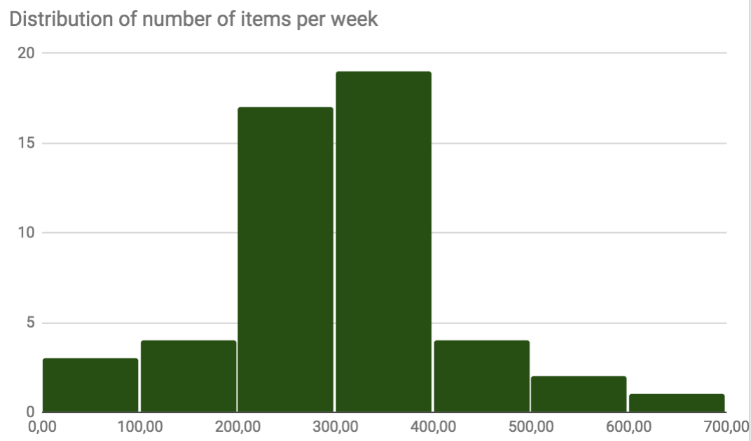
Insert>chartLook at the different chart recommendations. Click on the histogram, which depicts the distribution of the data. We can observe there are few weeks with a low number of received items, and few with a high number. In most cases, however, the number of received items in a week for the whole library lie between 200 and 400.
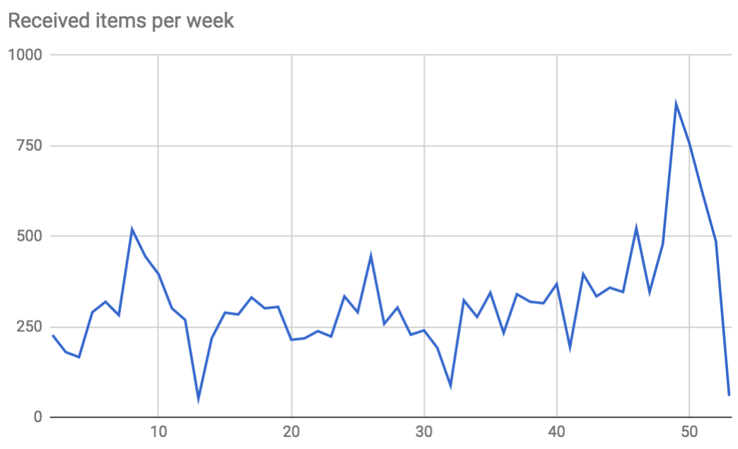
Now, select the line chart. What do you observe?
Change the title of the graph to
Received items per week.
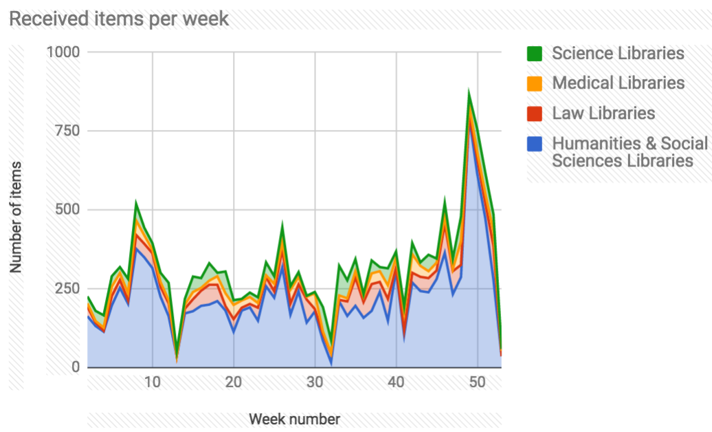
Let’s make this more interesting and add the different libraries.
Delete the chart (select the outline of the chart and press delete or backspace on the keyboard)
Columns: select
Add field. ChooseLibrary nameNow we have a plethora of names, so let’s filter them a little. <!–
Filter,
Add field>library name. Clickclear.Select your four favorite libraries (e.g., Humanities & Social Sciences, Science Library, Medical Library), but be sure to include the Humanities & Social Sciences library. –>
Remove the checkbox for
Show totalsfor all elements of the pivot tableAgain, select all data of the chart and select
Insert>ChartGo to chart types, and explore various visualization options. Which do you like most and why?
Now, insert the stacked area chart.
- Go to
Chart & axis titlesand add a descriptive title. Next, chooseHorizontal axis titleand assign ‘Week number’, and use ‘Number of items’ as theVertical axis title.Answer
Discussion
What do you think of this chart?
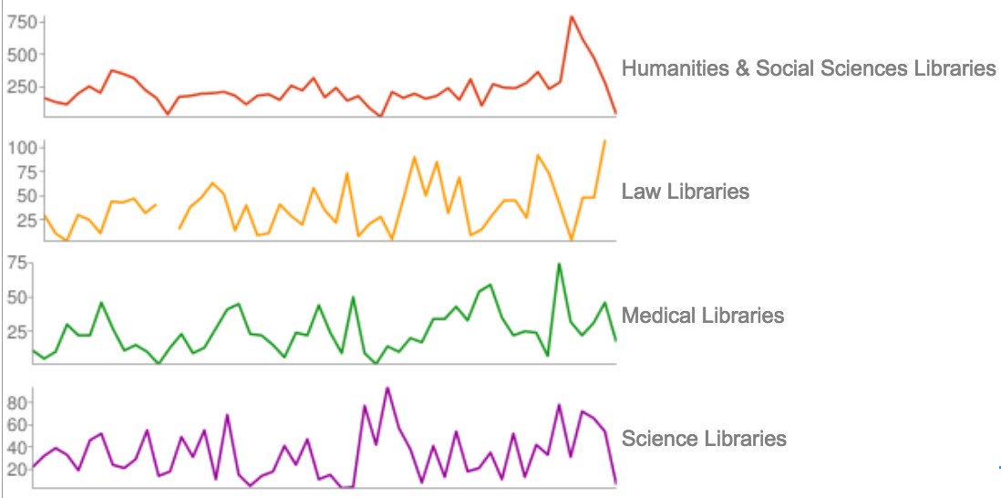
Insert a second chart. Go to chart types and select the sparkline chart (under the
othercategory). What can we observe here? (ignore the top line which is included in the chart).Answer
The empty parts of the graph are caused by the missing numbers in the pivot table. In Google Spreadsheets, there is no setting to automatically add zeroes when there are no values. This causes the line graphs to have omissions. In Excel, however, there is a setting to show zeros by default. This makes the data slightly easier to visualize without in-between steps. In another module, we will create a script for Google Sheets to do this for us.
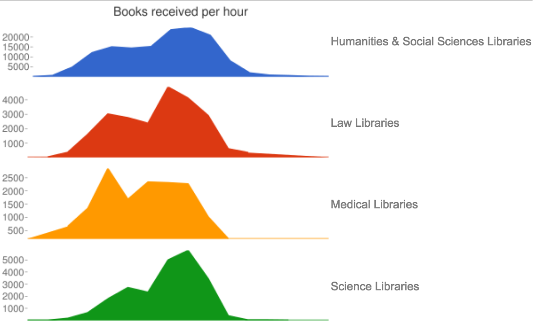
Let’s look at the data in another way, using the column we generated for the hour in which a library received a book.
Exercise 2: Visualizing received books per hour and per library
Let’s try out some other data. First we have to delete the previously selected elements of the pivot table.
Remove Rows:
Receiving weekby clicking the associatedX, and remove Values:Receiving week.Click Rows:
Add field, chooseReceiving hour. Click Values:Add fieldand chooseReceiving houras well. Make sure to setSummarize byto COUNTA (not SUM).Something strange happened in the second graph. To amend this, be sure to remove
Show totals. See how the graph changes accordingly.The top sparkline chart is faulty - it interprets the hours as values. Let’s remove this column from the source data of the chart. In the
Datadialog box, click onA1:E53(thedata rangeof the chart), and change it toB1:E53.Further format the chart to your liking. For instance, go to
Customizeand chooseSparklineand clickFill.Now, change the chart title to
Books received per hour.Answer
What can we learn from this? Of course, this is just an example, but the same method could be applied to e.g. the loan transactions during a day, to optimize personnel allocation. A lot of this data is actually available via Alma Analytics.
Now, let’s see how we publish the graph.
Select the three vertical dots in the top right of the chart
Choose
Publish chartNow select the chart you would like to publish, and choose
interactive. UnderPublished content and settingsyou can decide what content to publish, and whether to automatically republish after you make changesClick
Publishto get a shareable url. ViaEmbedyou can also integrate the chart in your website.In sum, we have seen that it is quite simple to publish our chart, and to possibly integrate it in our website. This is not yet very interactive though. In the last lesson of this course, we will experiment with plot.ly to achieve more interactivity.
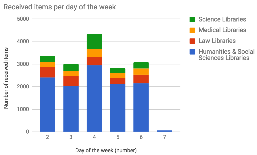
Extra exercises: Further exploring the Creation and Receiving dates
- Using the same steps as above, create graphs for Receiving day of the week.
Answer
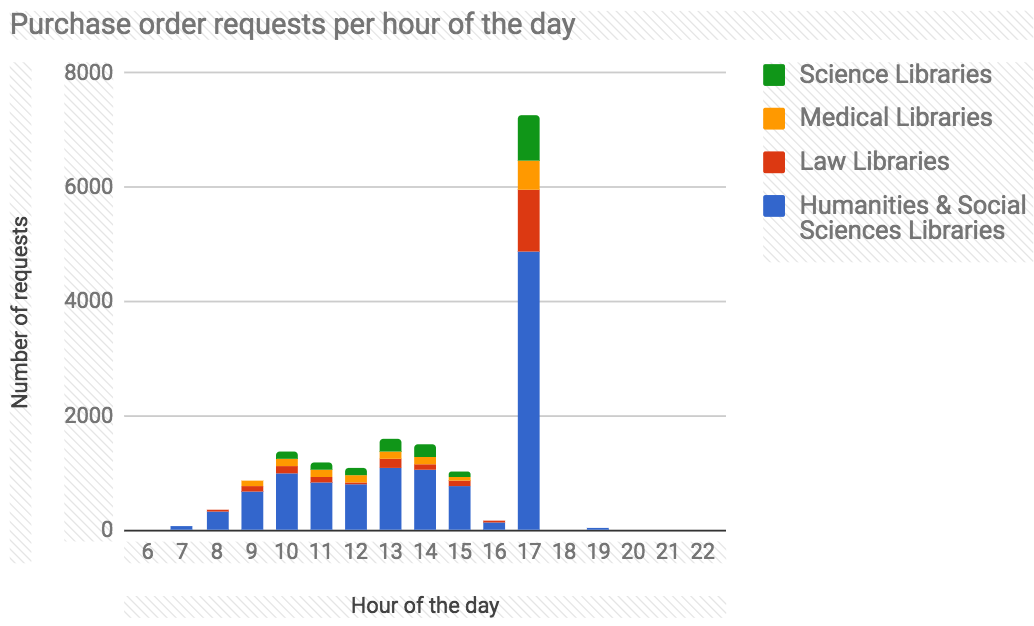
- Find out at which Time of the day most requests for new items (orders) are created. Hint: you have to create an additional column in the NewItems spreadsheet which extracts the hour of the
PO Creation Datecolumn (most likely columnKin your spreedsheet).Note: If the added column does not show up in the pivot table, you may have to edit the range of the pivot table (Via
Edit range), and add the letter of the added column (or alternatively you can decide to create a new pivot table from the original data).Answer
The output of this data is peculiar, since there is a ‘spike’ at 17.00 o’clock. This underlines the fact that often data analysis and visualization raises more questions than that it solves. For instance, this spike may be caused by automated processing taking place at five.
Some design recommendations
Line charts are an important part of the toolbox of a visualization creator. As EazyBI.com indicates, they should be used for continuous data, with equal intervals. Generally, line charts should start with 0 as the lowest vertical axis value, and time should be on the horizontal axis. In our case, we also see that we have to be careful with empty values in the pivot table, since they cause gaps our graphs. In this case, they should be replaced by zeroes, but this depends on the dataset.
We also tried out a stacked chart. These charts are useful to compare values. However, as we have observed, exact comparisons are tricky. In our case, we also saw that series with much larger values than the others may dramatically influence the slope of the graph. Also, no more than 3-5 categories should be used.
This all underlines that one should try out different visual representations of data, to obtain insights into the data at hand, but also to avoid getting potentially wrong impressions.
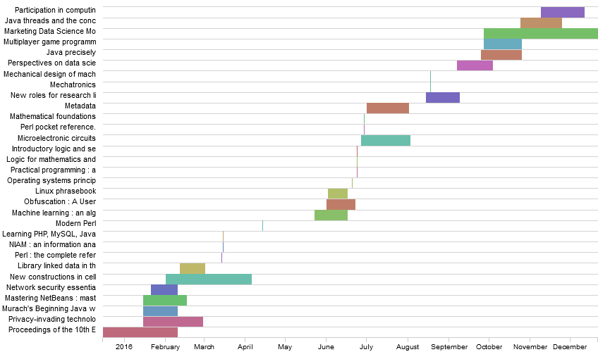
Other ideas to work with these data (to try at home):
You could use both the
creation datefield andreceiving datefields, and find out how long it takes before a book arrives. You could even compare this per library, and per publisher. To do so, you can create acreation weeknumcolumn using the same formula we used before, and create a pivot table combiningcreation weeknumand receivingweeknum.Then, there are various possibilities to visualize this, for instance in a GANTT chart, which can be made using the RAW framework, which we will first try out in the next module. An example of a GANTT chart for the time taken to receive a number of informatics books:
GANTT charts are in practice used often for project planning.
Read more:
- Chart usage guidelines: eazybi.com/blog/data_visualization_and_chart_types/
- Improving the ‘data-ink ratio’: darkhorseanalytics.com/blog/data-looks-better-naked
Key Points
{“Three types of variables”=>”numerical, ordinal (inherent order), and categorical (no inherent ordering).”}
Using formulas in a spreadsheet editor, it is possible to convert values in more convenient formats for visualization.
Line charts are a useful way to depict temporal data, but equal intervals should be used.
Stacked charts may look visually appealing, but cannot be used for exact comparisons.
Various other charts exist to show temporal changes, such as GANTT charts (often used for project planning).