Topical exploration and visualization in RAWGraphs
Overview
Teaching: 10 min
Exercises: 30 minQuestions
How can we explore the topics contained in the new items dataset?
How can we visualize data in more advanced ways then in Google Spreadsheets?
Objectives
First objective.
Topical explorations and visualization in RAW
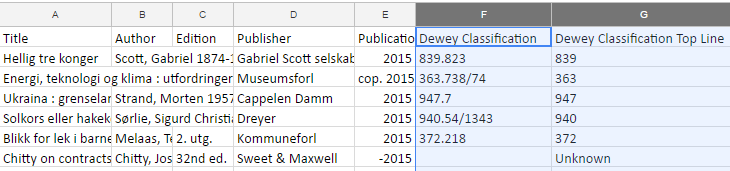
So far, we have mainly looked at authors, publishers, and how new book orders are distributed over time. There is additional topical data to explore in our dataset, including the Dewey Decimal Classification (DDC) numbers.
The Dewey Classification column of the new physical items dataset shows the full Dewey Decimal Classification number assigned to an item, while the Dewey Classification Top Line column contains the integer part of the decimal numbers (the part before the dot). Note that for some books, no DDC number has been assigned.
Data limitations
Some books have multiple DDC numbers assigned, but in this dataset, only one DDC number is assigned to each item.
Exercise 1: Get the number of books per Dewey number and per library in 2016
First, we will explore the data a little bit, in particular which DDC numbers are most frequent.
Select all data in the NewItems sheet (ctrl+A) and choose
Data>Pivot table.- For Rows: choose
add field:Dewey Classification top line- For Values: add
Dewey Classification top line(COUNTA)We just like to count the number of times a DDC number is mentioned. Lots of values, but we are most interested in the Dewey numbers with the highest number of books.
Now sort the table by the number of occurrences of a certain DDC number.
What do you observe in the table?
So, the top number is
839. Most likely you know which topic that is.We can see that the number 2 is
616(Diseases), and the number 3 is306(Culture & institutions). This may be different per library, actually, so let’s extend our table again.Let’s find out which library has acquired which types of books:
- Choose Columns and add the field:
Library nameLook at the table for a moment. Any observations?
- Filter the table by
Library name(selectHumanities & Social Sciences Library,Science Library,Medical Library)Let’s remove the unknown values for now.
- Add another filter: Filter by
DDC top line. Click onShow, and remove the checkmark in front ofUnknownYou can try to apply some visualizations to part of this table (do not select the whole table, but only a limited number of rows).
However, the table is far too large to visualize efficiently, so we have to simplify it a little bit.
To explore broader Dewey classes (and to better summarize our data), we will now expand our dataset by extending the data table.
[insert image]
Exercise 2: Extending the data table
It would be interesting to explore broader Dewey categories, so we have to extend our data table. The advantage of Dewey is that we know that the first DDC numbers represent the broadest classes.
We are going to create two new columns on the far right of the NewItems worksheet:
Dewey 100 groupandDewey 10 group.First, we are going to prepare the
Dewey 100 groupcolumn.
Go back to the NewItems sheet. In the first empty column on the right, click on the cell in the second row (since the first is the title) and insert the following formula:
=LEFT(G2;1). This formula selects 1 character, starting from the left (the=RIGHTformula, does a similar thing, but starting from the right - we won’t use that formula for now). Note thatG2indicates that the character will be selected from ColumnI(make sure that this is the column labelledDewey Classification Top Linein your spreadsheet, otherwise, change the letterIfor the corresponding column).Now, we should see that the row is equal to the first Dewey digit
Select the cell containing the formula and copy it (ctrl+C)
Now select the whole column (click on the grey letter above the column) and paste the formula (ctrl+V). Now the whole column contains the formula.
Write the title of the column in the first row:
DDC 100 groupVerify that indeed all rows contain the first digit of a DDC number, and
Ufor unknown (you can do this manually by checking all rows; remember that another way for this check is to turn on the filter view).
Repeat all steps in this process for the second column, but change the formula to
=LEFT(G2;2). Hence, we select the first two digits of the DDC number.Name this column DDC 10 group.
Now, we can create a pivot table for this data. Select all contents of the table and choose
Data>Pivot tableto do so. Name itDDCPivot2.Discussion
Explore the data. Any observations? Try out a suitable visualization.
Introducing RAW
RAWGraphs is “an open source data visualization framework built with the goal of making the visual representation of complex data easy for everyone.” It can be freely used via the RAWGraphs website, and the source code can be downloaded. We will now use this framework for the following exercises.
Exercise 3: Visualizing Dewey categories in RAW
Now, we are going to visualize DDC categories using the RAW framework.
We start by extending our pivot table, remove any previous rows, columns and values from
DDCPivot2, if necessary.
Under Rows: add fields for
DDC 10 groupandDDC 100 group(in this order)Under Values: add a field for
DDC 100 group, with theCOUNTAfunctionUntick the box
Show totalsAdd two filters and untick the value
U(forDDC 10 group), andUN(forDDC 100 group)Now, select all values in the table (ctrl+A), and copy them (ctrl+C).
Go to: http://rawgraphs.io/ and click
Use it now!We see a screen named
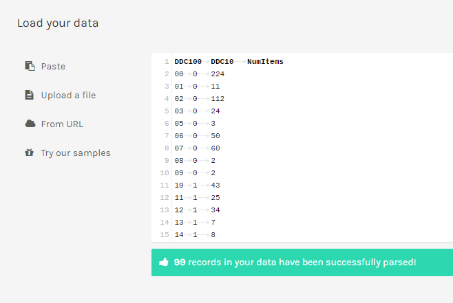
load your data. Here, we can paste our data, upload a file, add a URL or try a data sample. We choose the first option, and press ctrl+v to enter our data into the white field (replacing the messagepaste your data here from other applications).Now, the data is converted and ready to be visualized. However, we will still have to add the names for the columns, since that will make our lives slightly easier.
Go to the first row (record) in the white field, and hit enter to add an empty line.
Enter the following text:
DDC10 <tab> DDC100 <tab> NumItems. (<tab>indicating that you should press the tab key on your keyboard). By pressing the tab button you indicate that you describe the next column.The data should now look like the image below:
Now, scroll down. You see a plethora of charts which can be made using RAW (some more useful than others, admittedly).
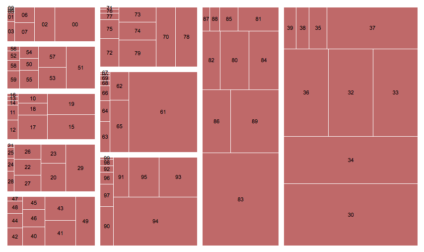
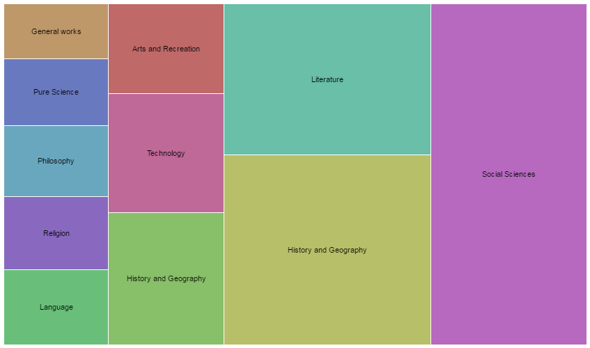
Explore the options for charts, read their descriptions, and finally choose the Treemap chart. Read the information on the left.
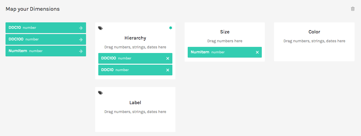
Scroll down to
Map Your Dimensions. Here, you can drag and drop elements from your data to different elements of the graph. First, dragDDC100tohierarchy, followed byDDC10. Finally, dragNumItemstoSize.
Voila, our first graph depicting DDC numbers in of our newest library items. The size depicts the number of books in each category.
Answer
This chart is still rudimentary, and only using red colors. So, we can spice it up a little bit.
- Drag
DDC10tocolorto make it a bit more ‘cheerful’ and easier to read. Notice the change in the chart.
Exercise 4: Exploring other visualization layouts
Let’s obtain some more overview per library.
Go back to the spreadsheet (
DDCPivot2)
- Filter add field (
Library name): SelectHumanities & Social Sciences Library,Science Library,Medical LibraryandLaw Library- For rows choose
DDC 100(remove the totals) andLibrary name(remove the totals).- For values, make sure that
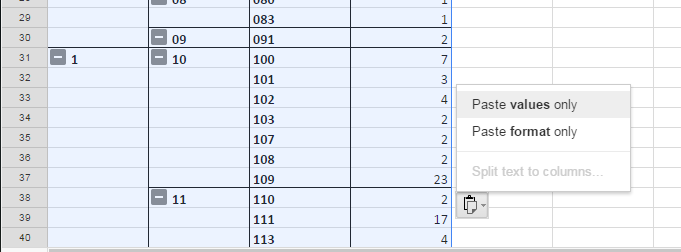
DCC 100is selected (summarized byCOUNTA). Remember to untickUandUNin theLibrary namefilter.Now, we run into another issue with many empty rows (in Column A) that we encountered before. These will prevent us from visualizing this data correctly in RAW. Let’s amend that by copying all data and pasting it in a new worksheet.
Copy the whole table (ctrl+A). Click the
+under the worksheet to create a new worksheet.Paste the copied data into the new worksheet (ctrl+V). Choose
Paste values onlyusing the icon on the bottom of the screen to remove the formatting.Call the sheet
DDCLibraryNow, add a row above the first (right-click and select
Insert 1 above)Name the first column
DDC100, the second,Library, and the third,CountNow replace the empty cells by the numbers written in the cells above. (We now do this manually, but there also automatic ways to do this in Excel and in Google Spreadsheets).
Select the whole table (ctrl+A) and copy it (ctrl+C). Now open a new tab with RAW. Paste the copied data into the
Load your data fieldSelect the
Circle Packing layoutand check the descriptionScroll down to
Map your dimensions. DragLibraryandDDC100toHierarchy,Counttosize,LibrarytocolorandDDC100tolabel.
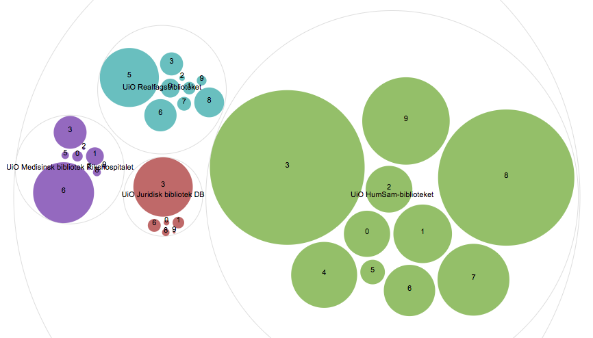
Experiment with other ways to visualize this dataset. Be sure to try out the Treemap and Sunburst. What do you think?
Extra exercise 5: Adding names for the Dewey classes and automating the replacement of empty cells by the values above them
Let’s extend the table and add the names for the Dewey classes.
- Go back to the Spreadsheet,
DDCPivot2.Add the
DDC 10group again (under Rows in the pivot table), and reorderDDC 100group andDDC 10group by dragging one above the other . Remember to untickshow totals. The table now first shows a top dewey number, then the 10 numbers.- Add a third row:
Dewey Classification Top Line(remove the checkmark forshow totals)- Remove
DDC 10 groupfrom values (if it was there), and addDewey Classification top lineinstead. Choosesummarize by COUNTA.We now have a more comprehensive DDC table. Like in the previous exercise, we have to copy it from the pivot table to a new worksheet to do some more processing, though.
- Copy the whole table (ctrl+A). Click the
+under the worksheet to create a new worksheet.- Paste the copied data into the new worksheet. Choose
Paste values onlyusing the icon on the bottom of the screen to remove the formatting.
- Insert one column on the left (right-click the first column and choose
insert 1 left).- For each number in the second column, add the corresponding label of the Dewey class in the leftmost column. For instance, for
0, addGeneral works, and for1, writePhilosophy and psychologyDone? Now we need to fill up the empty cells under each value in the table with the value above. Since this will be quite tedious to do manually, and Google Spreadsheets does not have a menu for this (as Excel does), we have to extend Google Spreadsheets with an a script to do that.
- Go to
Tools>Script editorHere, you can create scripts to extend the functionality of Google Docs. First, we have to remove all existing text in the editor.
Let’s use an existing script. Just copy all text in the box below, and paste it in the Script editor (under the “Tools” menu). (This script is adapted from a StackOverflow suggestion).
function onOpen() {
   var ui = SpreadsheetApp.getUi();
   // In case of a Google Document, use DocumentApp, or FormApp for a Google Form.
   ui.createMenu('Custom Menu')
       .addItem('Fill Blank Cells', 'menuItem1')
       .addToUi();
}

function menuItem1() {
   fillBlankWithAbove()
}

//Iterates over the range from top to bottom and left to right, and fills blank cells with the value right above them.
function fillBlankWithAbove() {
   var sheet = SpreadsheetApp.getActiveSheet();
   var range = sheet.getActiveRange();

   var values = range.getValues();
   var width = values[0].length;
   var height = values.length;

   for (var i = 0; i < width; i++) {
       var lastVal = '';
       for(var j = 0; j < height; j++) {
           var currValue = values[j][i];

           var dataType = typeof(currValue);
           //Empty string check returns true if dataType is a number, and value is zero. In that case we don't want to overwrite the zero, so only check emptyString for string types.

       if(currValue === undefined ||
           (dataType === 'string' && currValue == '')
       )  {
           //getCell parameters are relative to the current range
           //and ones based
           var cell = range.getCell(j+1, i+1);
           cell.setValue(lastVal);
       } else {
           lastVal = currValue;
       }
   }
  }
  SpreadsheetApp.flush();
}
- Now, in the script editor, choose
Publish>Deploy as Web appName the projectFillBlanks- In the next dialog box, leave all settings as they are (
only myself), and choosedeploy- Then you have to authorize the web app by selecting your Google account and/or writing your password.
- Go back to the spreadsheet. Refresh the page, and a new option
Custom Menushould have appeared.- Now select the first column (
A), and selectCustom Menu>Fill Blank Cells. Do the same for the next two columns (BandC)- Something went wrong! The leading zeroes of the DDC numbers have been removed. Let’s undo (ctrl+Z). Now select column
BandC, and chooseFormat>Number>Plain text.- Again run
Custom Menu>Fill Blank Cellsfor columnBandC. Verify that the numbers are correct.- Add a top row with a suitable name for each column
Done! Now we can finally visualize our refined graph.
- Select the whole table (ctrl+A) and open a new tab with RAWGraphs. Paste it into the
Load your data field- Select
Treemap, again. Try out different options to visualize this data.
Key Points
There are several formulas useful for clustering data (e.g., selecting the first or two characters of a column value)
RAWGraphs extends the visualization possibilities of Google Spreadsheets and Excel, it is open source, and easy to use for everyone
We confirmed, once more, that data have to be normalized and completed to generate useful visualizations
Using “scripts” in Google spreadsheets can be useful for these normalization and completion tasks